The Starbucks logo is one of the world’s most recognizable symbols, welcoming millions of coffee enthusiasts every day. But did you know that the iconic logo has a tiny secret that most people overlook? While the Siren’s face appears perfectly symmetrical at first view, a closer examination reveals an intriguing feature. Let’s look at the narrative behind this hidden element and why it makes the logo so special.

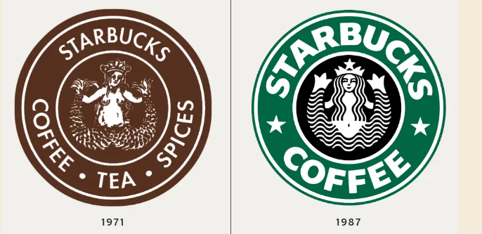
The Starbucks logo has changed multiple times since the company’s inception in 1971. The initial logo was brown and featured a double-tailed mermaid, often known as a Siren, which was influenced by maritime motifs and Herman Melville’s Moby Dick novel. The hue changed to the now-familiar green in 1987, and the logo was modified in 1992, when Starbucks became public.
1 However, the most important modification occurred in 2011, when the words “Starbucks Coffee” were deleted from the design, leaving only the Siren’s face.The Siren in the Starbucks logo represents more than simply a gorgeous face. Starbucks chose the Siren to represent coffee’s alluring attraction, enticing customers in the same way that mythological Sirens drew sailors to their fate.
But when Starbucks sought to broaden its products beyond coffee and enter new markets, they recognized that the Siren would need to develop to properly reflect the brand’s larger goals.When Lippincott’s global branding team set out to update the Starbucks logo in 2011, they envisioned the Siren representing confidence, appeal, and approachability. Initially, they created a symmetrical, faultless rendition of the Siren’s visage, but something seemed odd. “She was uncannily beautiful, a little creepy, to be honest,” said creative director Connie Birdsall. The Siren’s exquisite symmetry made her appear unnatural, nearly artificial.

The team determined that to make the Siren more approachable and human, they needed to incorporate a minor flaw. “The imperfection was important to making her really successful as a mark,” Birdsall explained. Look closely at the Siren’s face. While it appears symmetrical at first glance, you’ll realize that one side of her face differs somewhat from the other. Specifically, the right half of her face is more darkened, and her nose is slightly lower on that side. This modest asymmetry humanizes her looks and makes the logo more welcoming.
According to design partner Bogdan Geana, “It felt a bit more human and less like a perfectly cut mask” after adding the asymmetry. This modest but significant feature elevated the Siren from a beautiful figure to a relatable emblem for millions of coffee consumers worldwide.The decision to make the face on the Starbucks logo asymmetrical contradicts the prevalent understanding that beauty is found in symmetry.

However, the Starbucks team recognized that excessive perfection could make the Siren appear cold and distant. They added a tiny asymmetry to make her appear more approachable and nice. This was a vital step toward ensuring that customers felt a stronger connection to the brand.In the same revamp, Starbucks removed the words “Starbucks Coffee” from the logo. By this point, the Siren had become so well-known that the company no longer needed text to explain its brand.

This enabled Starbucks to expand its products beyond coffee, now include everything from morning items to nighttime snacks and beverages such as wine. When you next get a cup of Starbucks coffee, take a close look at the Siren. Her minor asymmetry serves as a reminder that imperfection may make something more relevant, human, and approachable. This hidden feature in the Starbucks logo is more than simply a design quirk; it demonstrates the impact of intelligent branding.